
- Student Group: Northwestern University Master of Science in Analytics (MSiA)
- Team Members: Vincent, Emma, Hao, Logan, Brooke
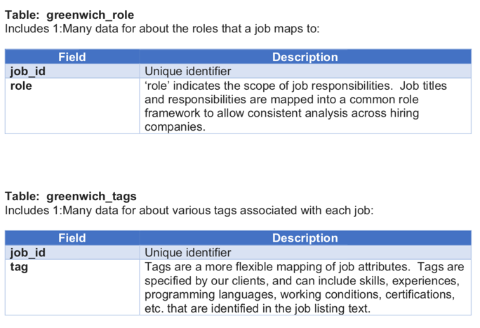
- Client: Greenwich.hr
- Tableau Dashboard
1. Purpose and Objectives
- Collaborate with Greenwich to do exploratory analysis and visualize the labour market data last year by creating Tableau dashboard.
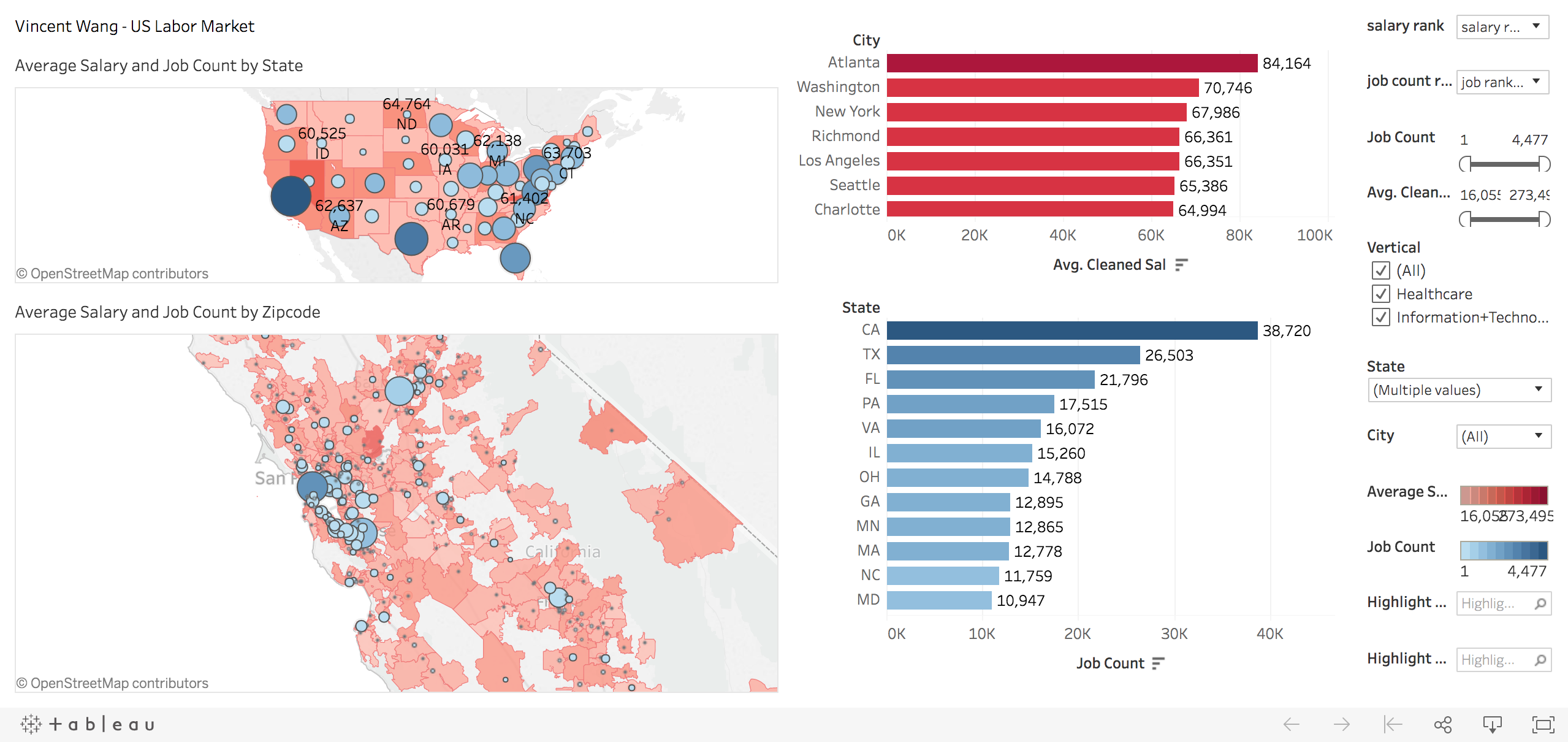
- Conduct the geospatial visualize of the job opportunities and salary level of US Labor market based on the Greenwich database.
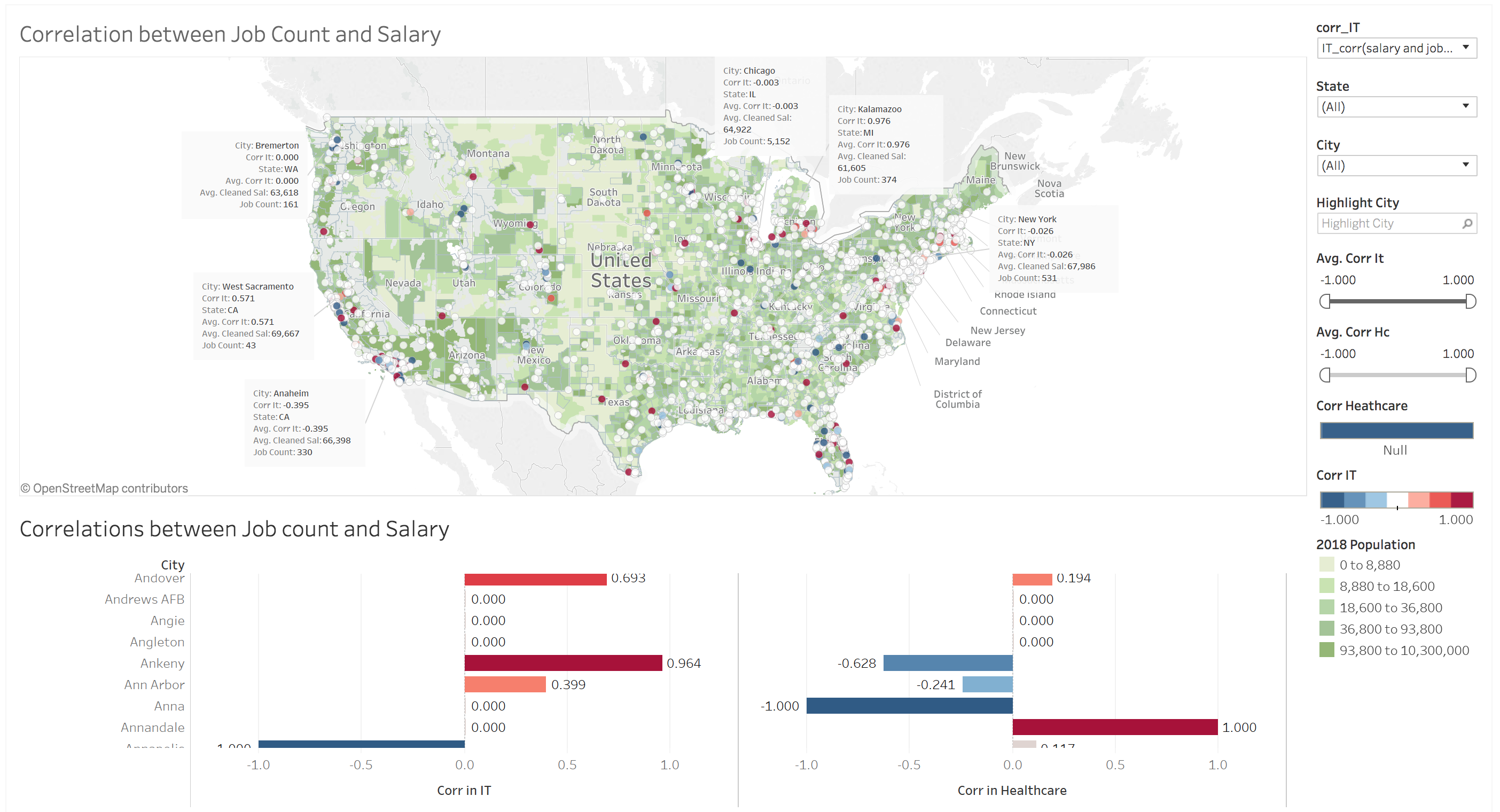
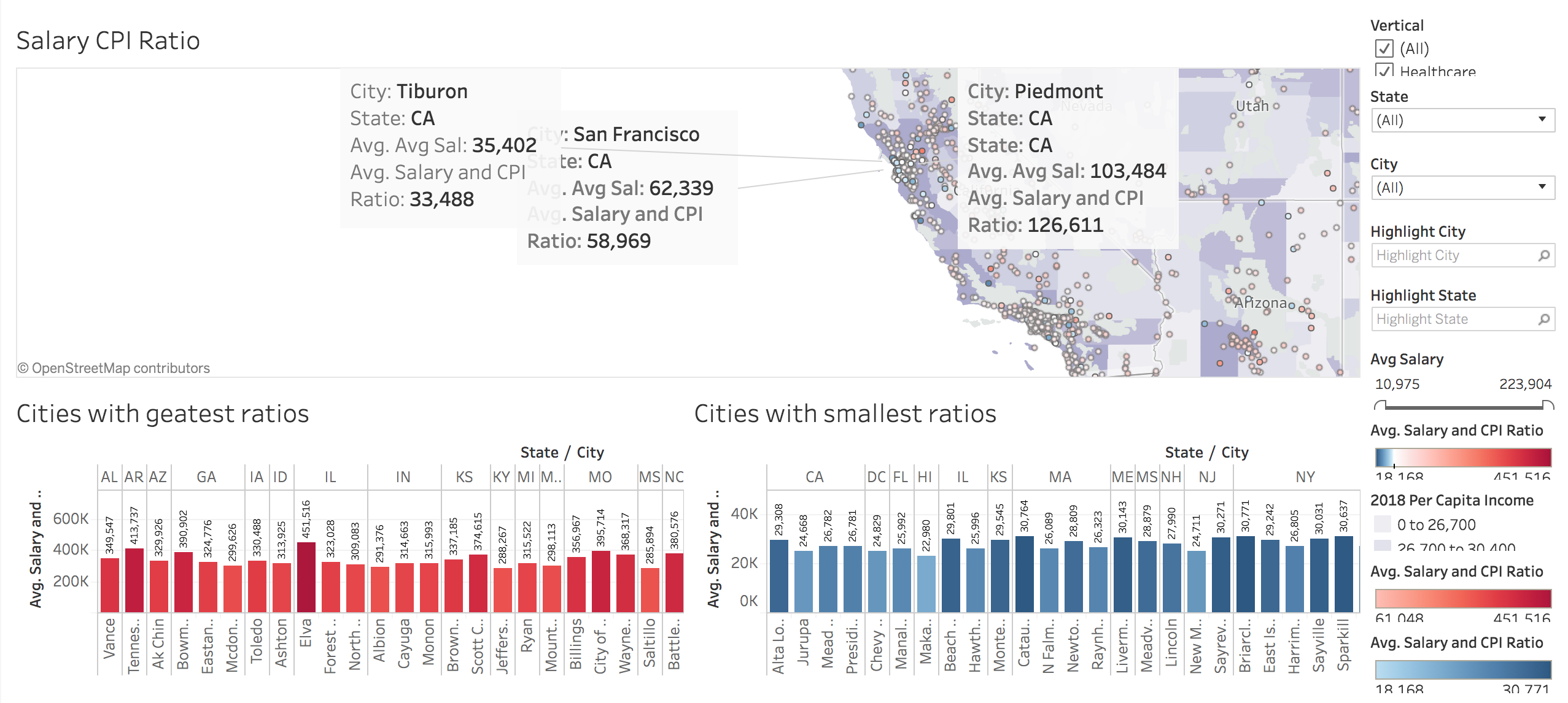
- Find out the spatial correlation between job count, salary, and CPI.
- Find out the correlation between the skills and salarys.
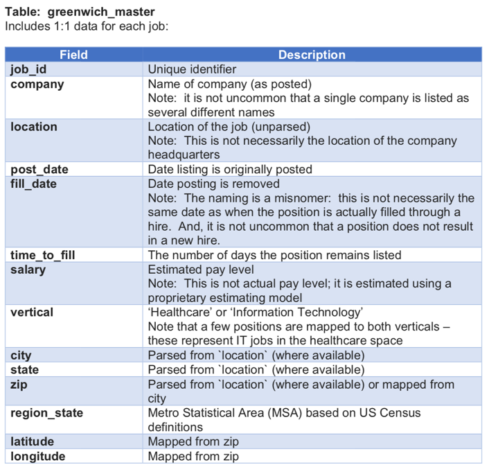
2. Dataset
- Location data: zip code, address, long/lat
- Time series: time to post, time to fill
- Categories: Company, role, tags
- Response: salary
- External data:
- CPI by city
- Population density by zip code
3. Data Cleansing
- Remove NA first (how to impute the NA): long and lat are missing, impute them by city locations (city and state).
- Merge three tables based on job-id
- One job id has different observations with different salary and different locations (average salary, and remain the location and rows)
- Reduce the data redundancy
4. EDA
- Summary the response variable: charts (density functions), monthly data, scatter plot
- Heatmap (nation wise) (city wise: Chicago, NYC, LA)
5. Sanity check
- One job id has several locations
- Job from NY CITY, some zipcodes are not in NY.
5. Tools
- Tableau
- Spatial Analysis(GIS)
- Shinny dashboard
6. Business Impacts
- Understand the US labor market,
- Recommend recruiting strategy to company.
- Help job seeker land best job
- Help Greenwhich.hr find the data mistake from their database